Visualize social data - fast, clear, and shareable
Paste a table or upload a CSV, ask in plain English, and Vizionary returns the right chart.
Why Choose Vizionary
Transform complex social data into clear, actionable insights with our intelligent visualization platform.
Clarity for social stats
Percentages, per-capita rates, and moving averages make differences and trends obvious.
Right chart, first try
Automatic selection for breakdowns, rankings, time intervals, cohorts, and correlations.
Ready to share
Clean labels, units, source captions, one-click PNG/PDF exports and shareable links.
What You Can Visualize
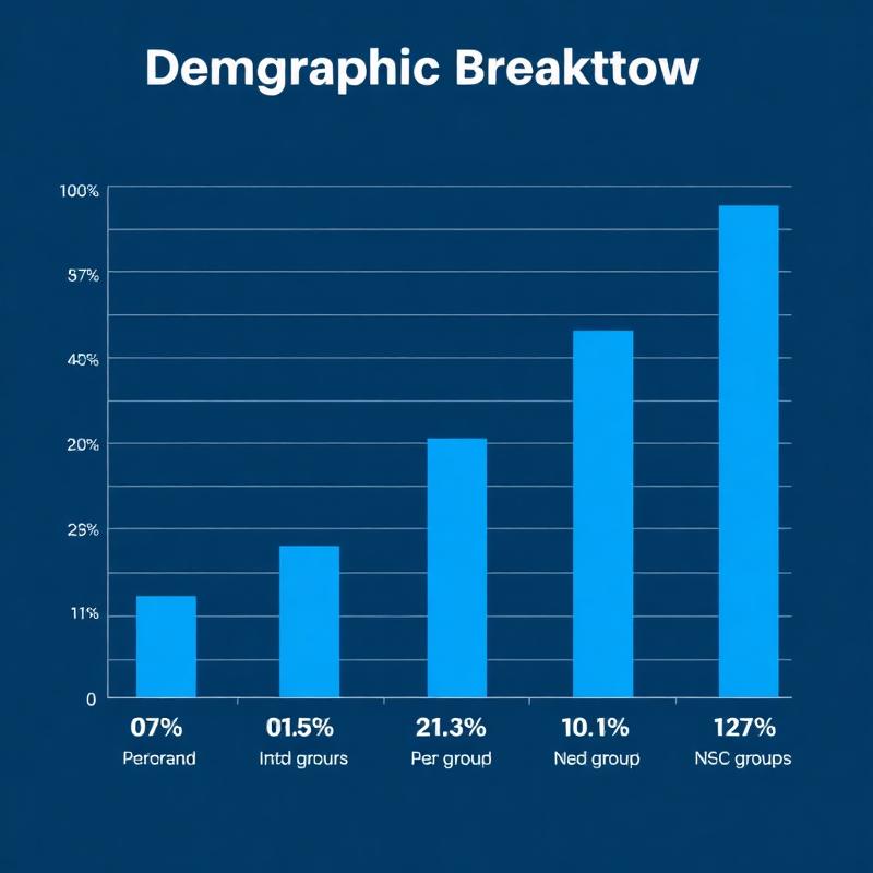
Demographic breakdowns
Counts & percentages across groups; highlight gaps.
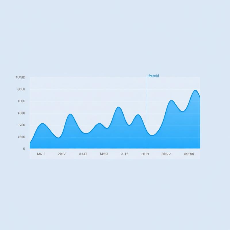
Trends over time
Hourly/daily/annual patterns with peaks and change callouts.
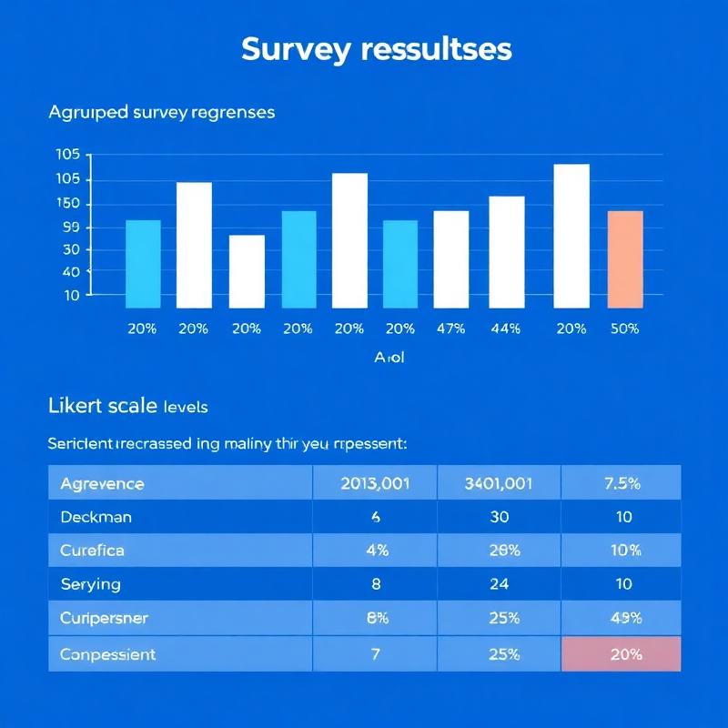
Survey results & sentiments
Summaries of choices, agreement levels, top issues.
From raw data to social insight—in seconds
Create clear, shareable visuals for research, policy, and coursework.
